Modals, Modals, Modals. Aight I'm sure you know what they are so let's go with the code.
Here is the code sandbox link if you just want to check out the code
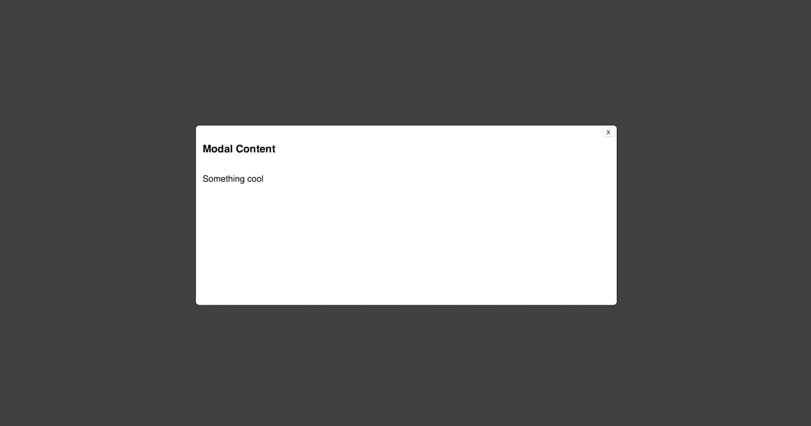
This is what we will be making
But for some more step-by-step with some explanations continue to read below.
Ok, so we got set up with either CRA or an initialization command for React. Now create a component folder and create a Modal.js file.
- In Modal.js, we are going to wrap the returned component with empty brackets
<> </>We are doing this because we will have only the button show while the rest will live inside a div. - As for props, we will be taking in only 2, the
titleand thechildrenfor each modal since we want this to be a reusable component. The title will be what our modal button will say while children will house whatever we want the modal to contain. - We will create a button that will be the trigger point for opening the modal.
import React, { useRef, useState } from "react";
const Modal = ({ title, children }) => {

  return (
    <>
      <button>{title}</button>
    </>
  );
};

export default Modal;
- We will have a
Modal Backgroundwhich will have a dark background color which would make the current window a bit darker to give a focused and clearer view of the modal. It will need to span the entire viewport. This div will also have the attached ref.
import React, { useRef, useState } from "react";
const Modal = ({ title, children }) => {

  return (
    <>
      <button>{title}</button>
      <div className={"modal-body-container"} ref={ref}></div>
    </>
  );
};

export default Modal;

- Now create a div that has a className of
modal-content. This will be our container that holds the contents of the modal component.
import React, { useRef, useState } from "react";
const Modal = ({ title, children }) => {

  return (
    <>
      <button>{title}</button>
      <div className={"modal-body-container"} ref={ref}>
             <div className={"modal-content"}>

             </div>
      </div>
    </>
  );
};

export default Modal;
- Inside the modal-content div we will include the button to close the modal view and the children props. For simplicity's sake, we will just use
Xas the button text.
import React, { useRef, useState } from "react";
const Modal = ({ title, children }) => {

  return (
    <>
      <button>{title}</button>
      <div className={"modal-body-container"} ref={ref}>
          <div className={"modal-content"}>
            <button
              className={"modal-close-btn"}
            >
              X
            </button>
            {children}
          </div>
        </div>
    </>
  );
};

export default Modal;
- We will use
useStateto hold a boolean value to determine if the modal should be open or closed.
const [isModalOpen, setIsModalOpen] = useState(false);
- We will also use
useRef which when set to an HTML element can give us access to its element object like.current. It'll be initialized as null but we will be attaching it to our div with the className ofmodal-body-container`. - We will write a function that when we click off the modal will also close it. What this means is that if whatever we press is not the modal-content element, then it will setIsModalOpen to false which will close the modal.

- Now attach the
setIsOpenModalfunctions to the onClick event handlers for the buttons. We had two buttons. One to open it and the other to close. Find them and just insert the appropriate boolean. Ex)
<button onClick={() => setIsModalOpen(true)}>{title}</button>
- Last but not least for the modal-bg div, we will include an
onClickevent handler and put ourcloseModalfunction that we made.
<div
        className={`modal-bg`}
        style={{
          backgroundColor: "rgba(0,0,0,0.75)",
          display: `${isModalOpen ? "block" : "none"}`
        }}
        onClick={closeModal}
      >
....
Complete Modal Component Code
import React, { useRef, useState } from "react";
const Modal = ({ title, children }) => {
  const [isModalOpen, setIsModalOpen] = useState(false);
  const ref = useRef(null);

  const closeModal = (e) => {
    if (ref.current === e.target) {
      setIsModalOpen(false);
    }
  };
  return (
    <>
      <button onClick={() => setIsModalOpen(true)}>{title}</button>
      <div
        className={`modal-bg`}
        style={{
          backgroundColor: "rgba(0,0,0,0.75)",
          display: `${isModalOpen ? "block" : "none"}`
        }}
        onClick={closeModal}
      >
        <div className={"modal-body-container"} ref={ref}>
          <div className={"modal-content"}>
            <button
              className={"modal-close-btn"}
              onClick={() => setIsModalOpen(false)}
            >
              X
            </button>
            {children}
          </div>
        </div>
      </div>
    </>
  );
};

export default Modal;
Now once that we are done with the Modal Component, let's add some styles.
.modal-bg {
  position: fixed;
  top: 0;
  left: 0;
  right: 0;
  bottom: 0;
  width: 100vw;
  height: 100vh;
  display: flex;
}

.modal-body-container {
  width: 100%;
  height: 100%;
  display: flex;
  justify-content: center;
  align-items: center;
}
.modal-content {
  position: relative;
  padding-bottom: 5rem;
  width: 50%;
  min-height: 300px;
  background: white;
  opacity: 100;
  overflow-y: auto;
  padding: 0.75rem;
  border-radius: 0.375rem;
}
.modal-close-btn {
  position: absolute;
  right: 1px;
  top: 1px;
  outline: none;
}

.children {
  display: flex;
  flex-direction: column;
  align-items: start;
}
Once it's all styled up go to App.js and add our Modal component. Go ahead and add your modal title and children wrapped in the Modal component. Check it out and if it works on your end that's a wrap.
import "./styles.css";
import Modal from "./components/Modal";
export default function App() {
  return (
    <div className="App">
      <h1>Home Page</h1>
      <h2>See Something cool here</h2>
      <Modal title={"Open Modal"}>
        <div className="children">
          <h3>Modal Content</h3>
          <p>Something cool</p>
        </div>
      </Modal>
    </div>
  );
}
